Creating Book Of the Bees and Monoprints for our A Cipher is a Key to a Code exhibition at the centre for recent drawing.
Phil Goss came to discuss what we would like to show in the exhibition. He said my Fissures Drawings – pewter metal pieces pinned to card- were like Jackson Pollock. An interesting comment, he thought the metal looked dripped like Pollock dripped his paint. The pewter is not dripped though but drawn. If you just dripped pewter it would bead and form solid discs as the surface tension of the metal holds the edges of the liquid together. Different materials behaving in different ways. But the lay person would probably not know this so it is useful to know how my work gets interpreted. I don’t want to be associated with Pollock.
Phil said he would like to see a book in the exhibition. Considering that Cedar in the unit 2 crit had said he would like to see one of the books full of prints I thought it was a good idea to make a book about bees.
Testing Paper for Mono printing
I tested different papers to find a paper that was strong enough to bind into a book but thin enough to give detailed mono printing marks. I went to Shepard’s Book Binders and felt their sample papers. I tear tested some sample sheets and found that the Offenbach bible paper (25% cotton) at 40gms was light weight and resistant to tearing. I choose two colours of bible paper- ivory and white. I also tested some 56gms Fabriano paper. I also found two Japanese papers Kozuke 45gsm and Shoji 48gsm both light weight and strong. I decided to try mono printing on the 4 different papers.
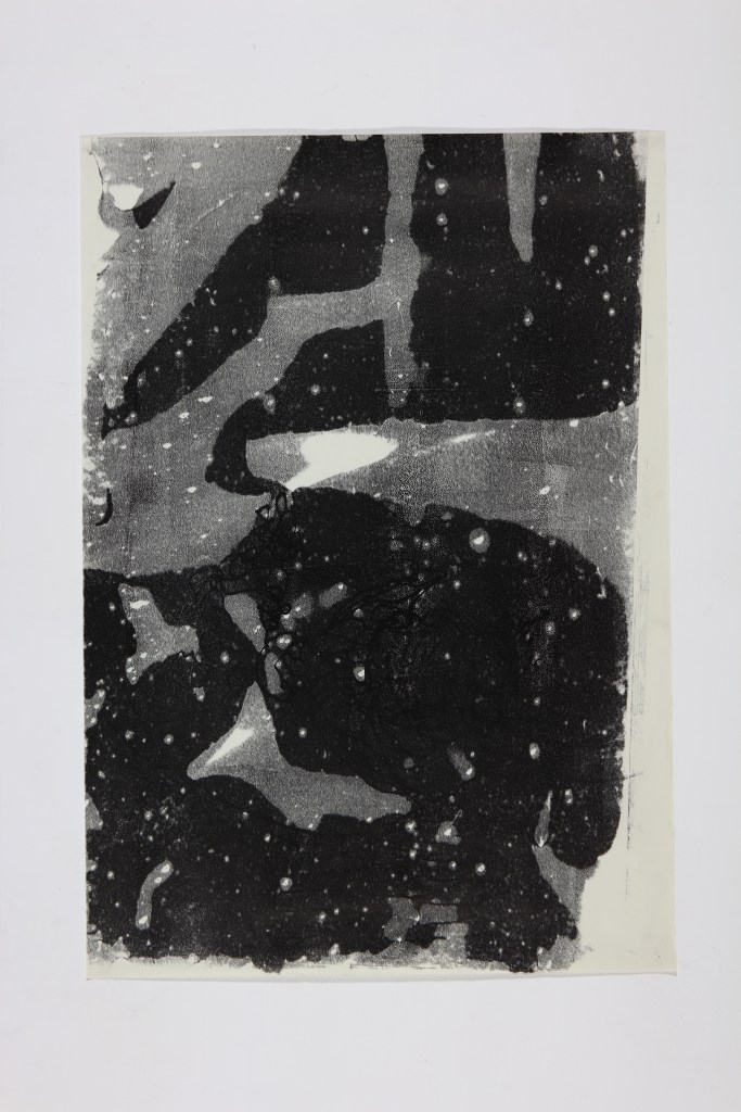
With these mono prints I was depicting the wings of Bee’s and wasps. I had been looking at the structure of the insect wings under the microscope at BENHS. I tested different amounts of ink on the glass surface and how each type of paper absorbed the ink and picked up the marks made by the different tools I used. I used pens, pencils, spoon, erasures, ends of paint brushes to give different types of marks. The longer I left the paper laying on the ink the more the ink was absorbed. I used oil based etching ink to give the deep black colour. Capillary action enabled the ink to be absorbed into the gaps between the paper fibres. The surface tension holding the ink together was less than the intermolecular forces on the surface of the paper so the ink was absorbed into the paper. The Bible paper gave an excellent mono printing surface because it was the most porous for the oil based ink. This meant that when a lot of ink was rolled out onto the glass surface the paper picked up a deep black layer of ink before a mark was made. This was the process of the materials acting together to create an image just by the laying of the paper. I think the absorption of the ink made a pattern imaging the texture of the keratin structure of a wing shining in the light. The prints only needed a small amount of mark making to be complete.
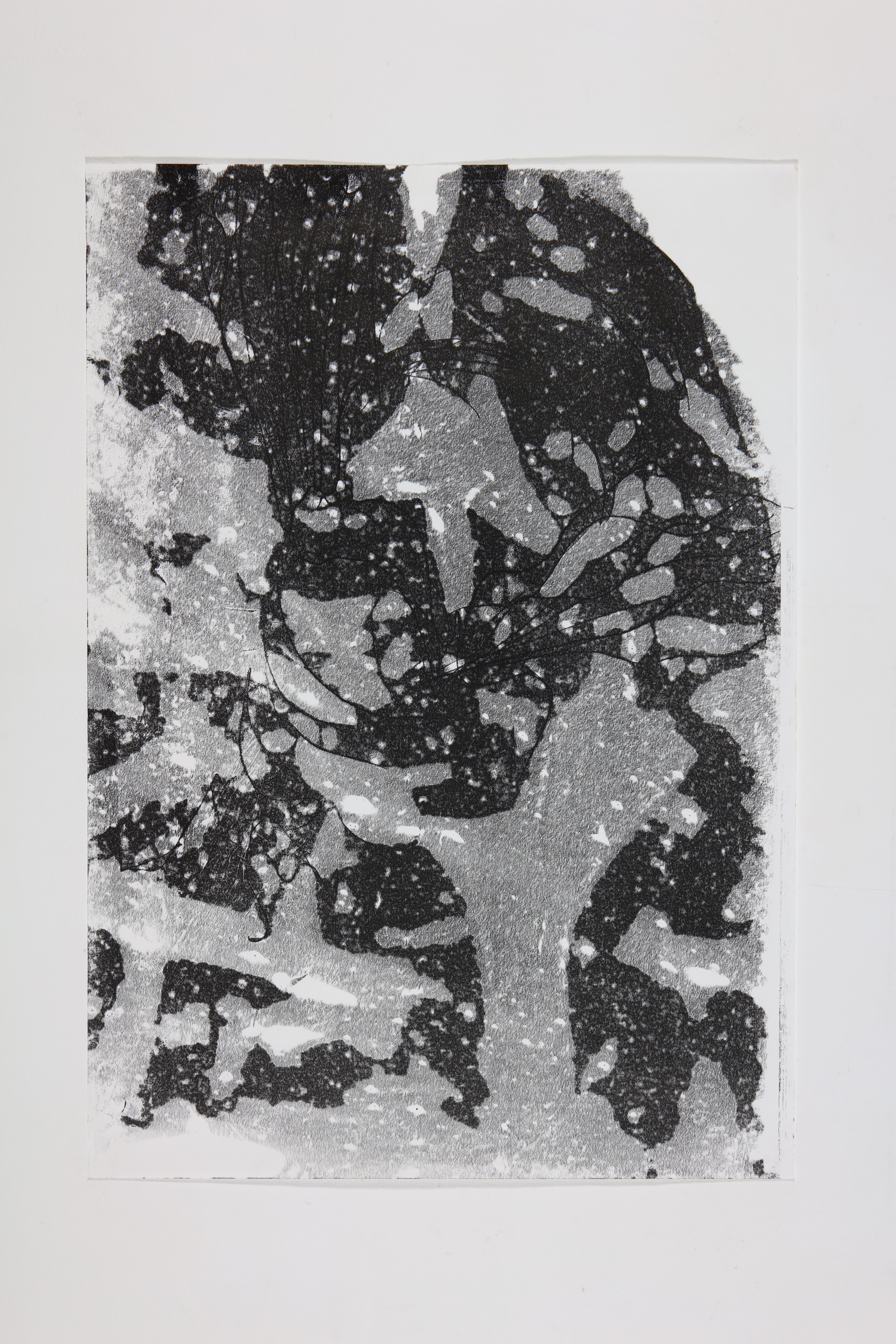
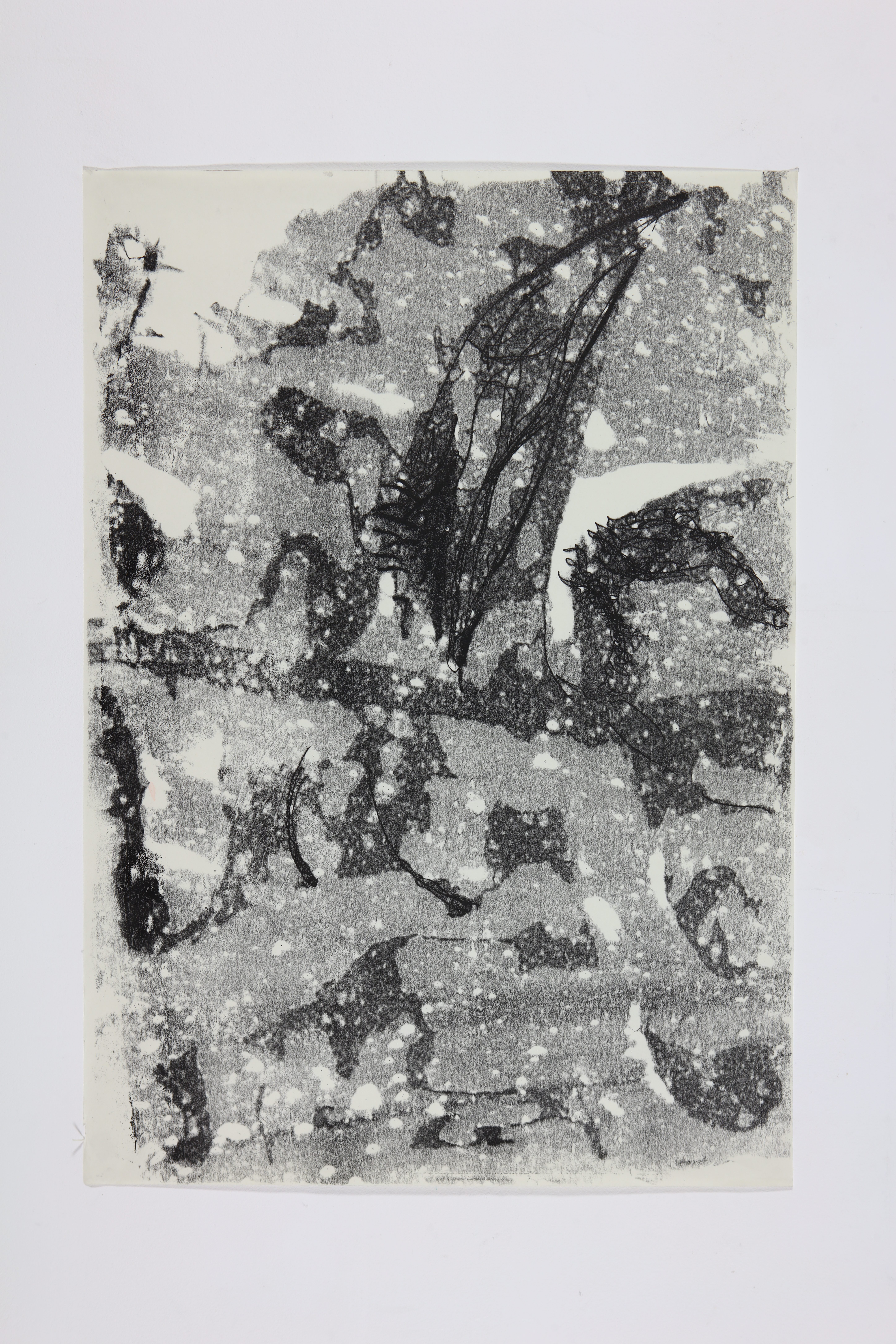
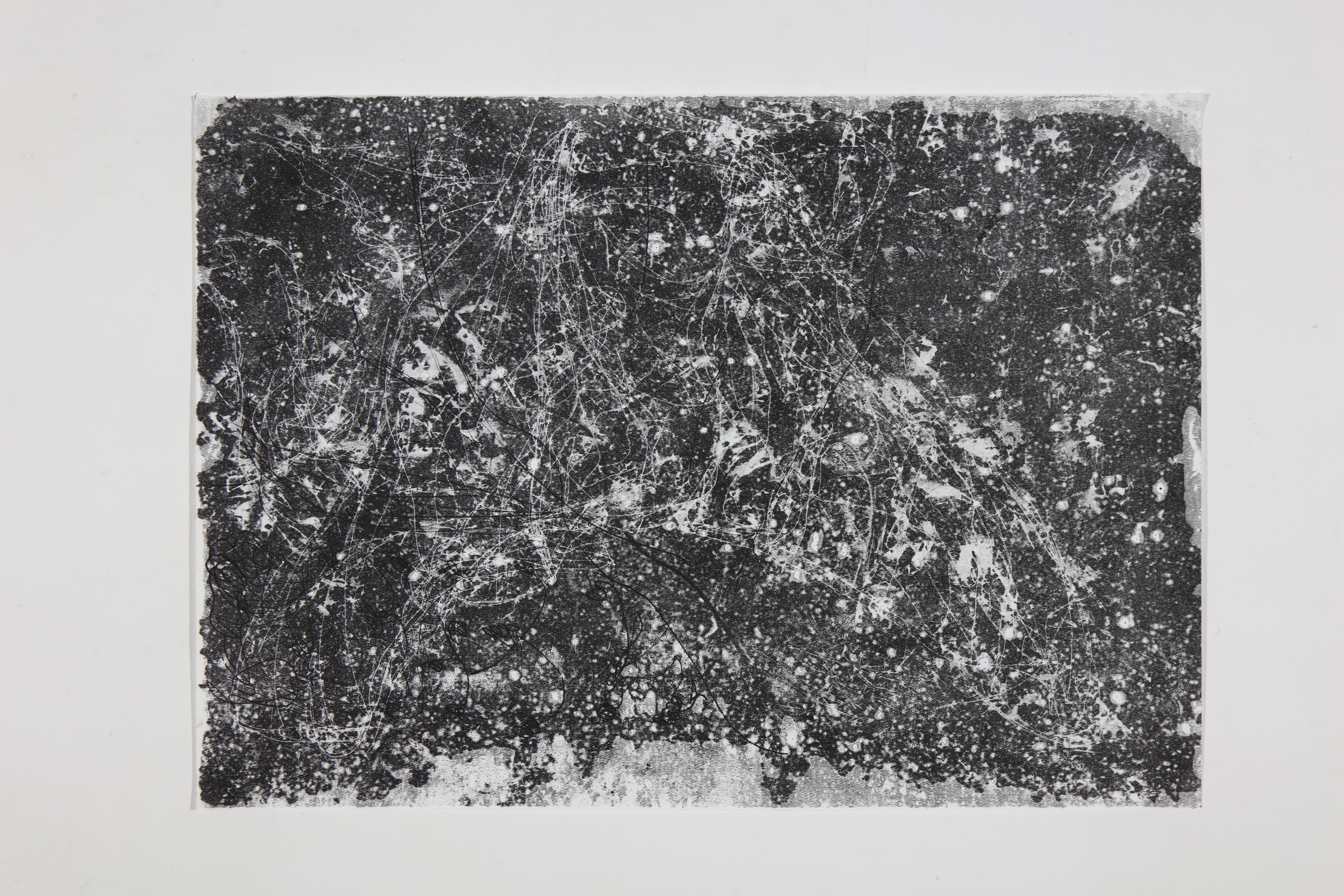
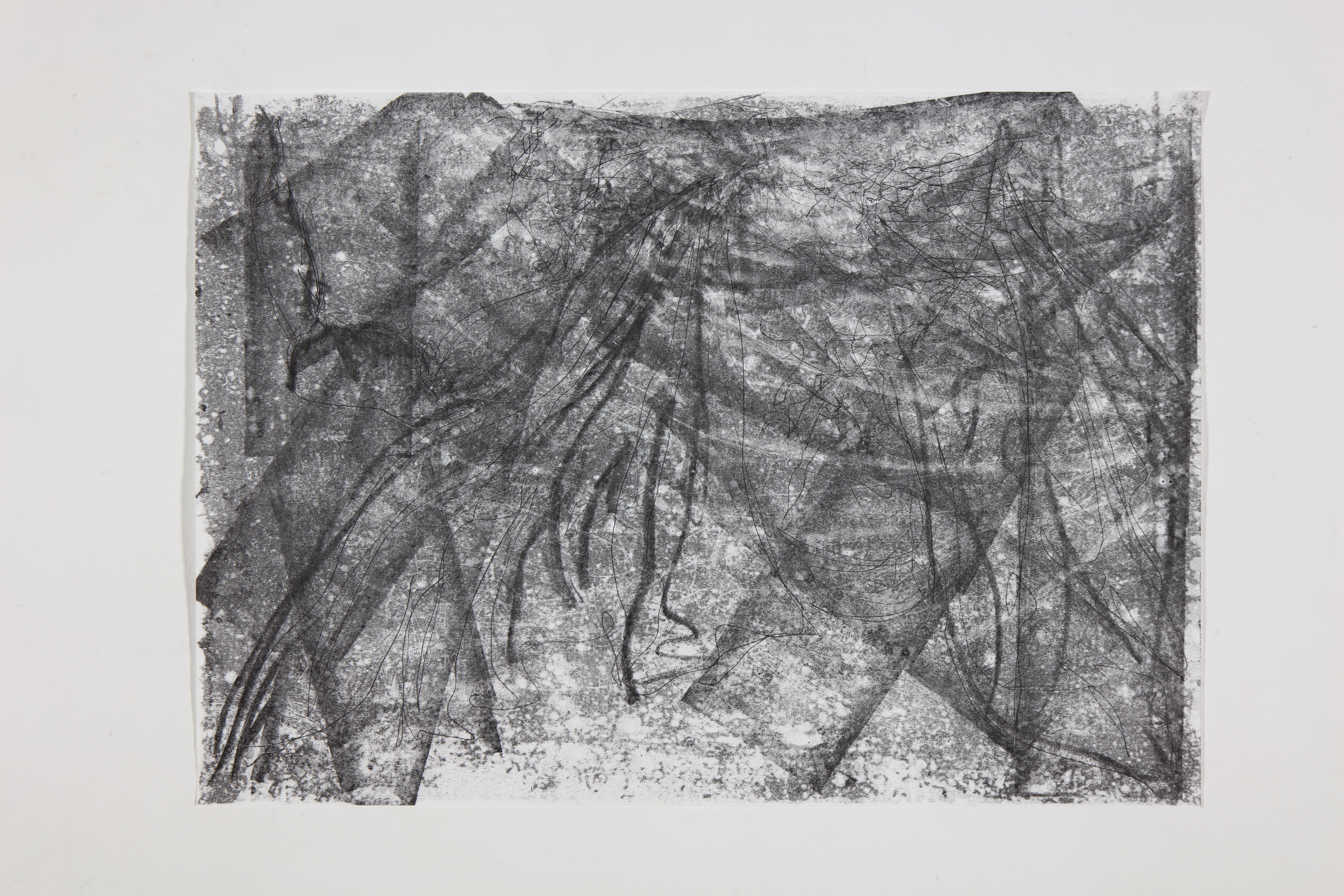
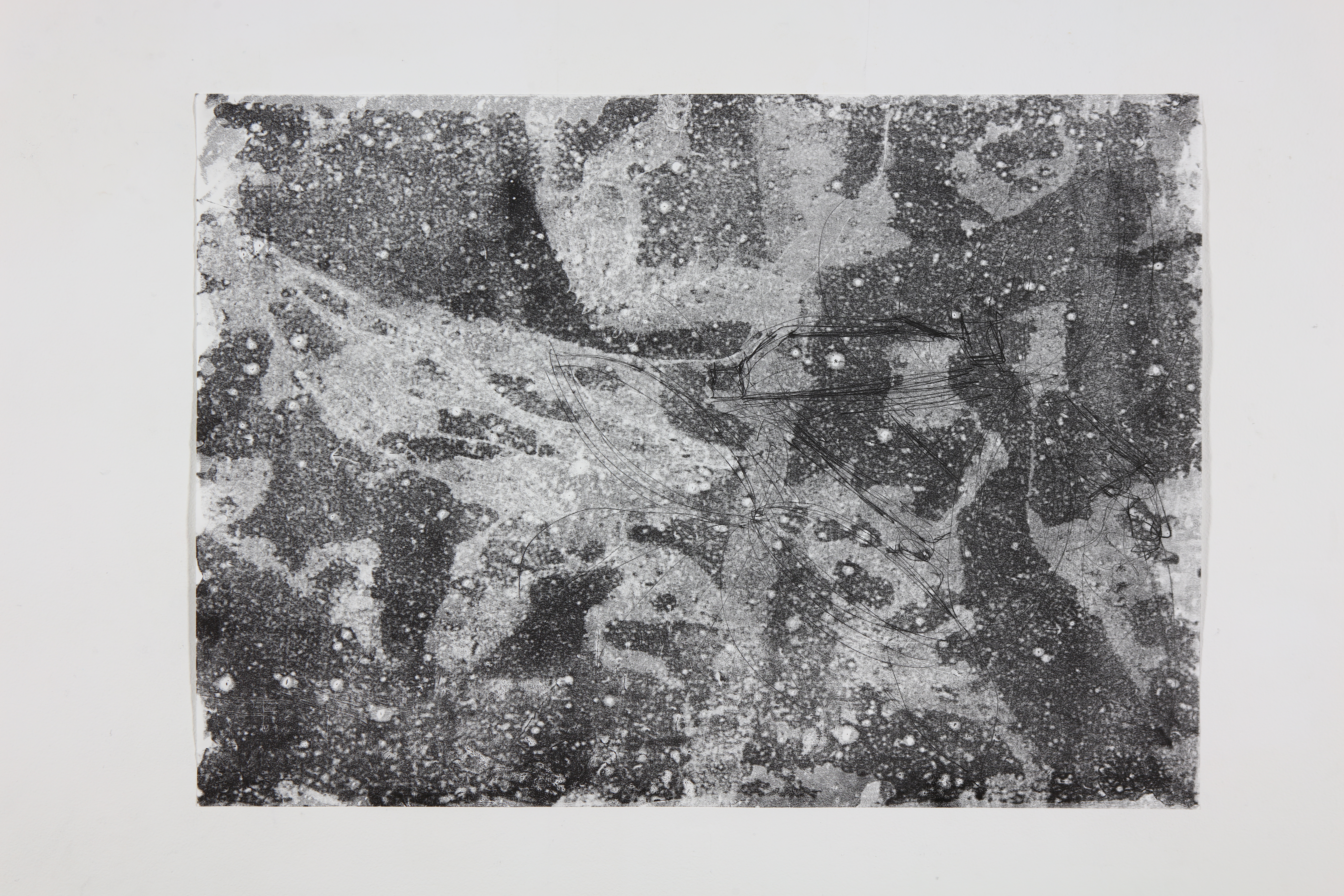
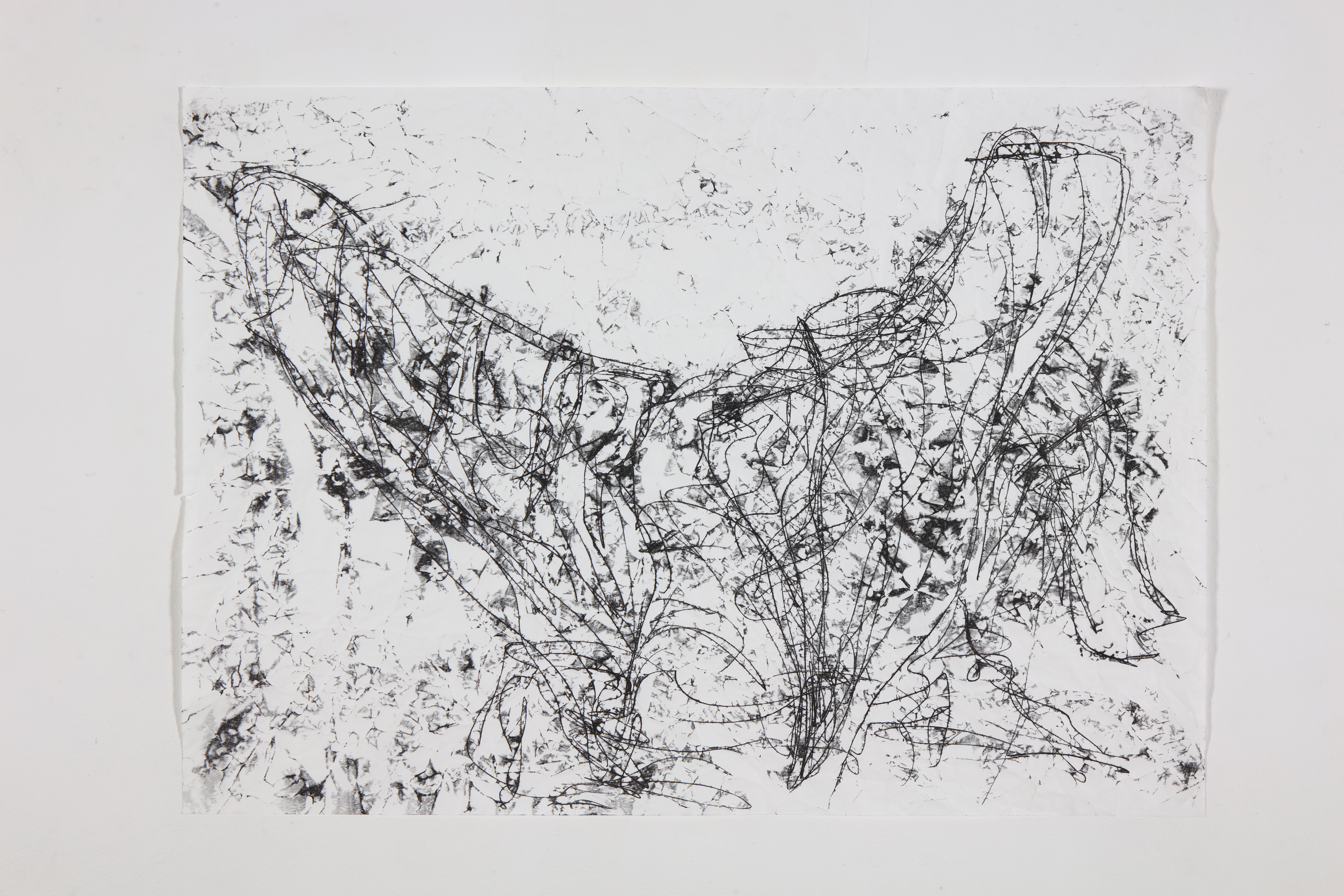
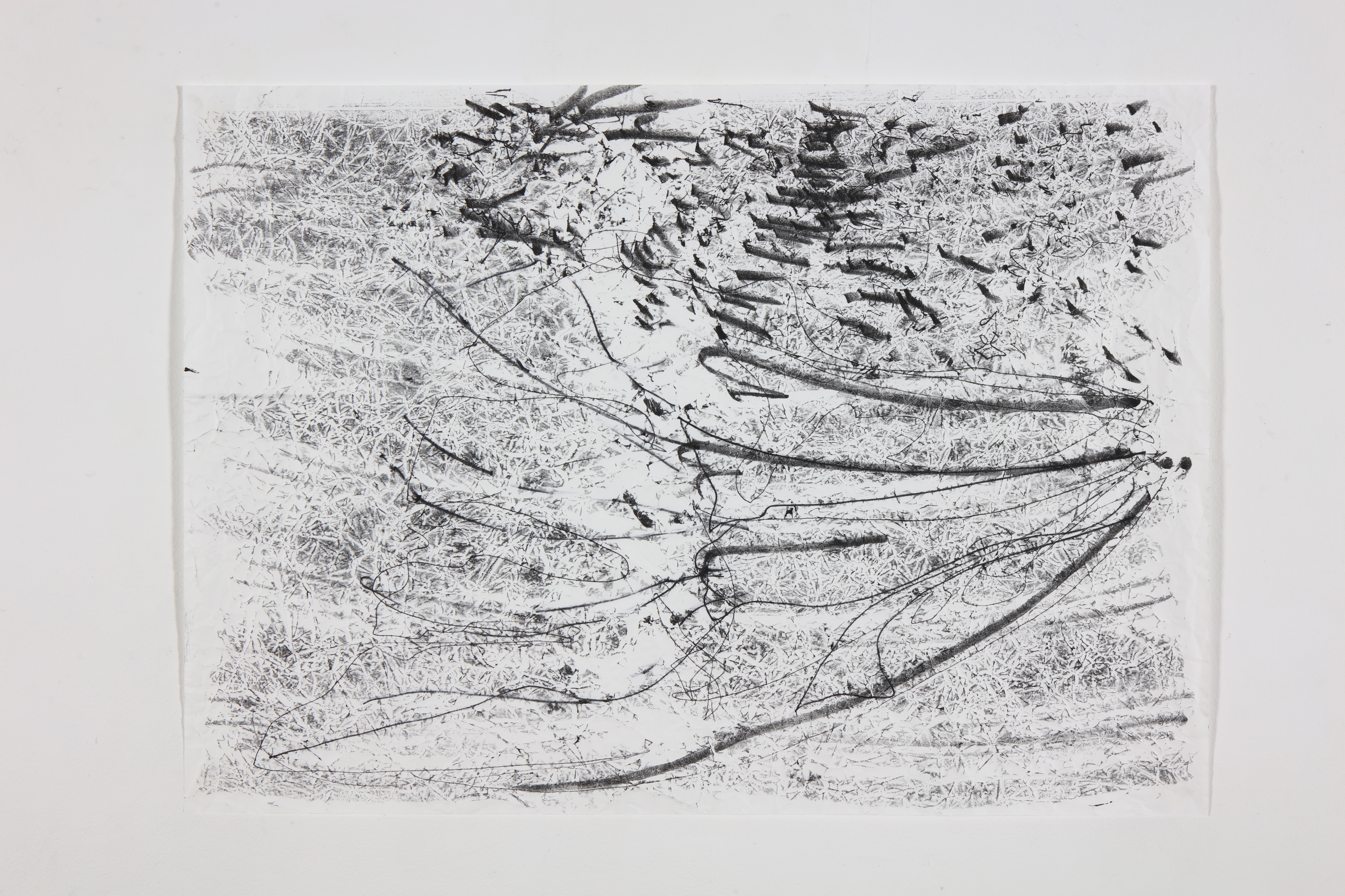
The Fabriano paper did not absorb very much ink when the paper was placed on the ink. This left the paper very white so the marks stand out against a white background. The paper is very smooth though and the marks did not have as much texture to them as the marks on the Japanese papers. This is useful if I want the mono print to be figurative. But overall I think these images have less impact when describing insect wings. I decided not to use the Fabriano paper for mono printing. I think the fibres in the Japanese papers are more entangled and so prominent and capture the ink better.
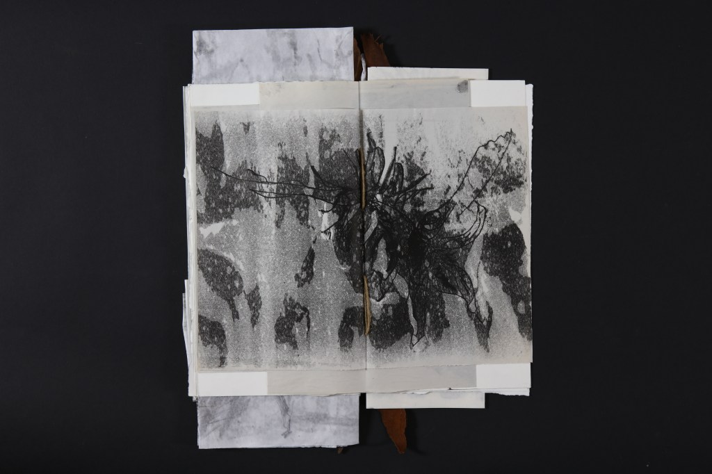
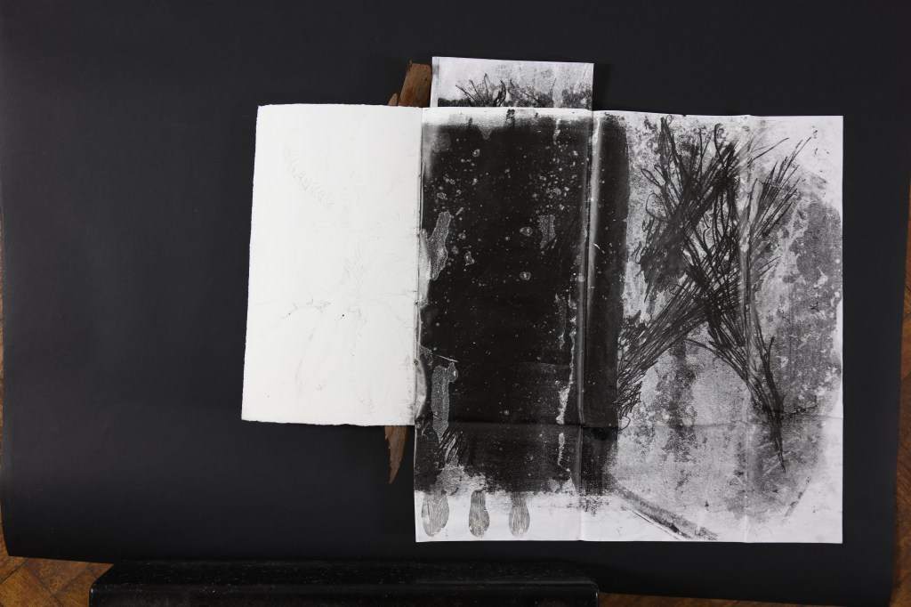
The Kozuke paper combines textured mark making with a textured back ground surface and is the paper that comes closest to newsprint in its versatility of mark making vs background texture. Sadly, I can not make a book of newsprint monoprints as the paper is not strong enough to be bound. The Kozuke is a Japanese calligraphy paper but I am using it the wrong way round as a Japanese student humorously told me. My mono print is on the back of the paper. The texture of the paper feels delicious to the figure tips compared to the smooth bible paper.
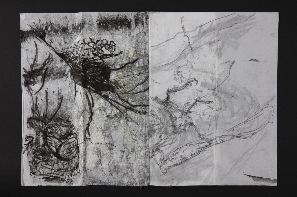
Shoji paper gave a very clean background while mono printing so wasn’t very absorbent. The lines are crisp and it would be a useful paper for detailed work which gave a clean blurred printed line.
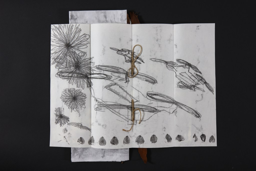
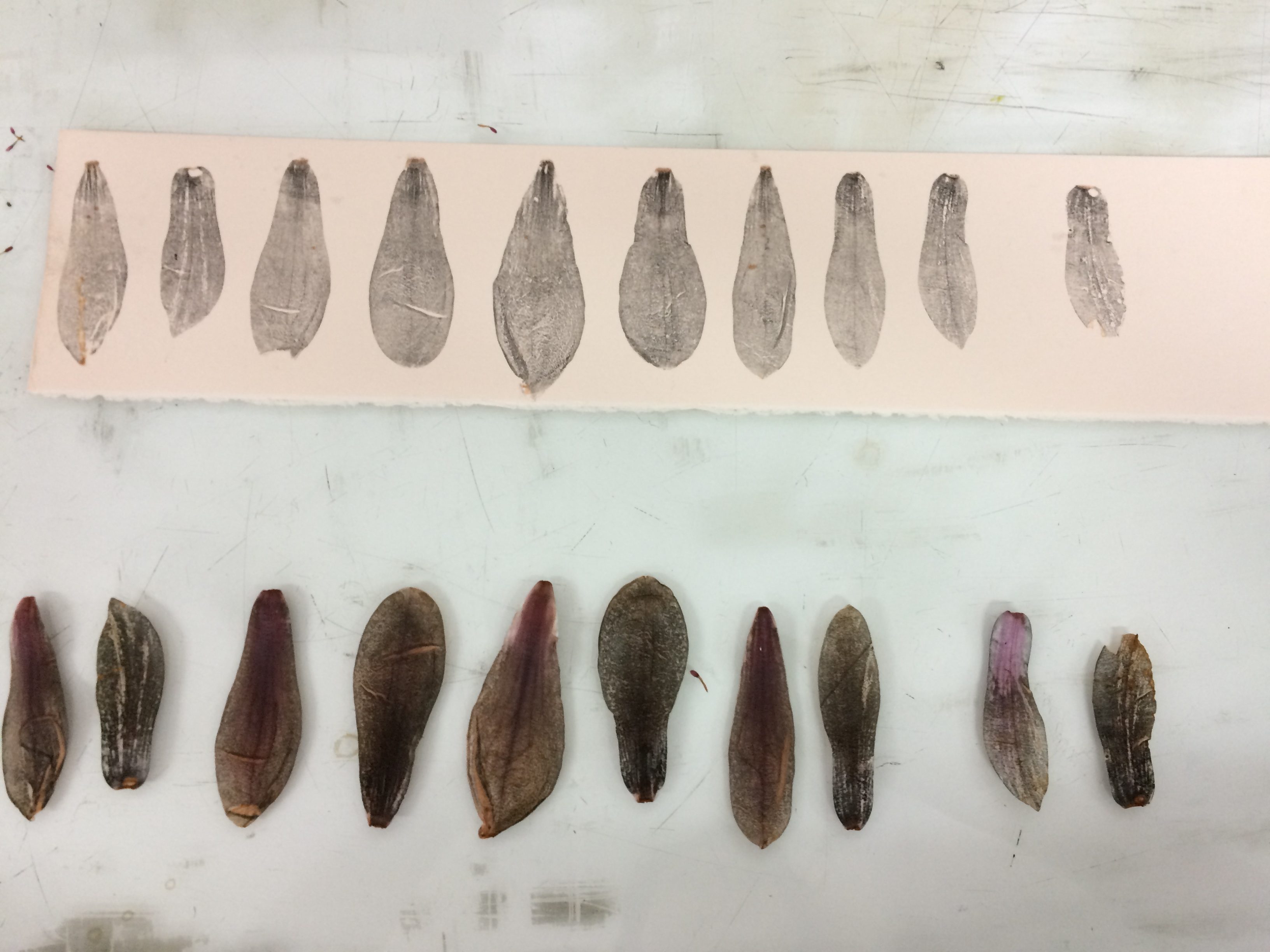
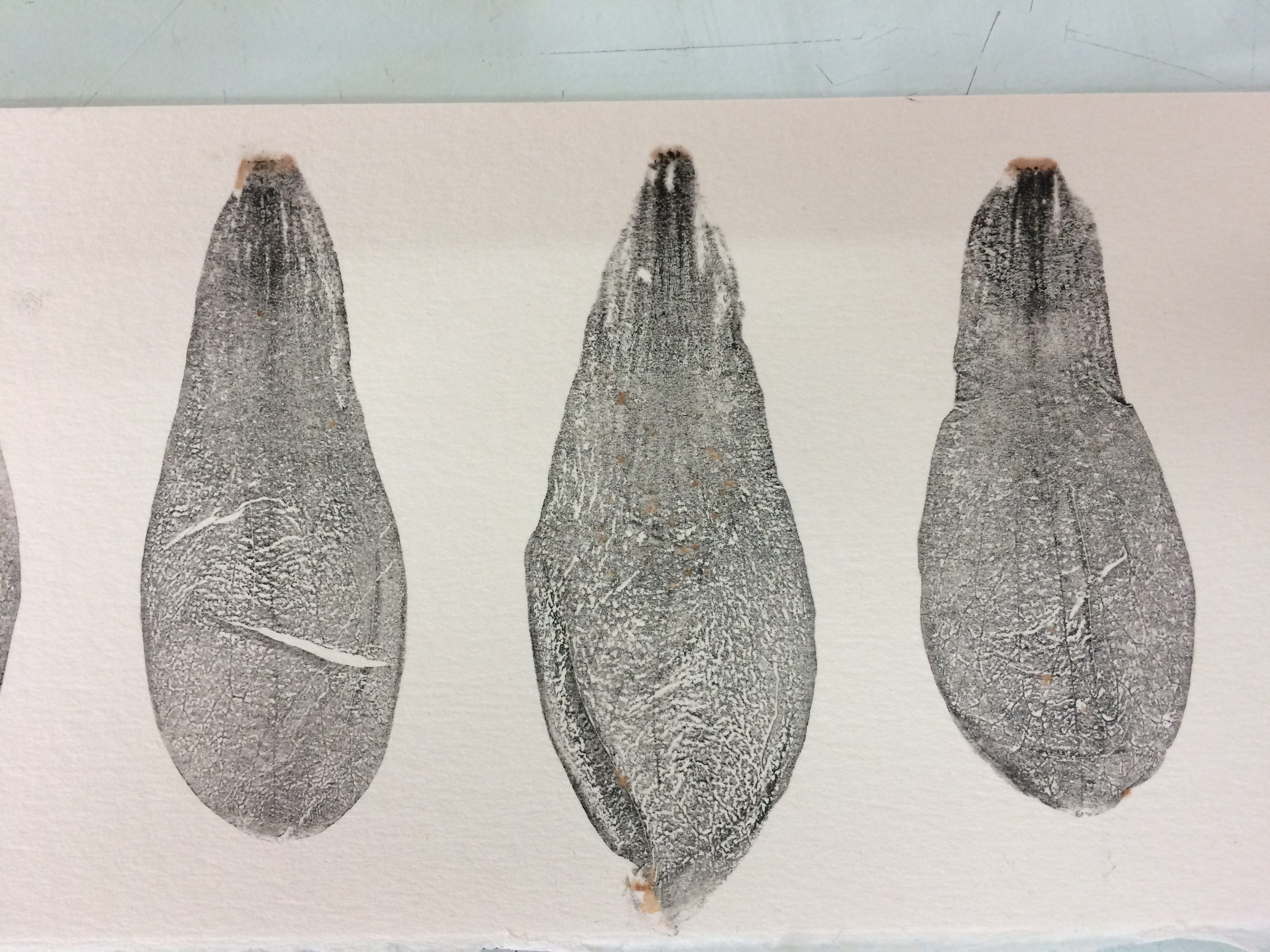
Relief printing using Magnolia Petals and black etching ink, the most interesting prints are where there is a large tonal range with in the image. This happens if you ink up the petal with different amounts of ink or print the petals multiple times during one inking. Also the rolling of the paper over the petal changes the way it is printed. A lot of the different outcomes happens by chance.
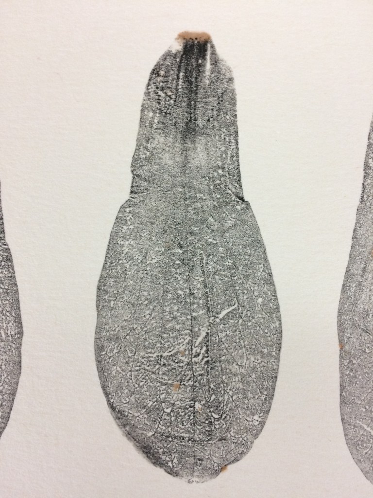
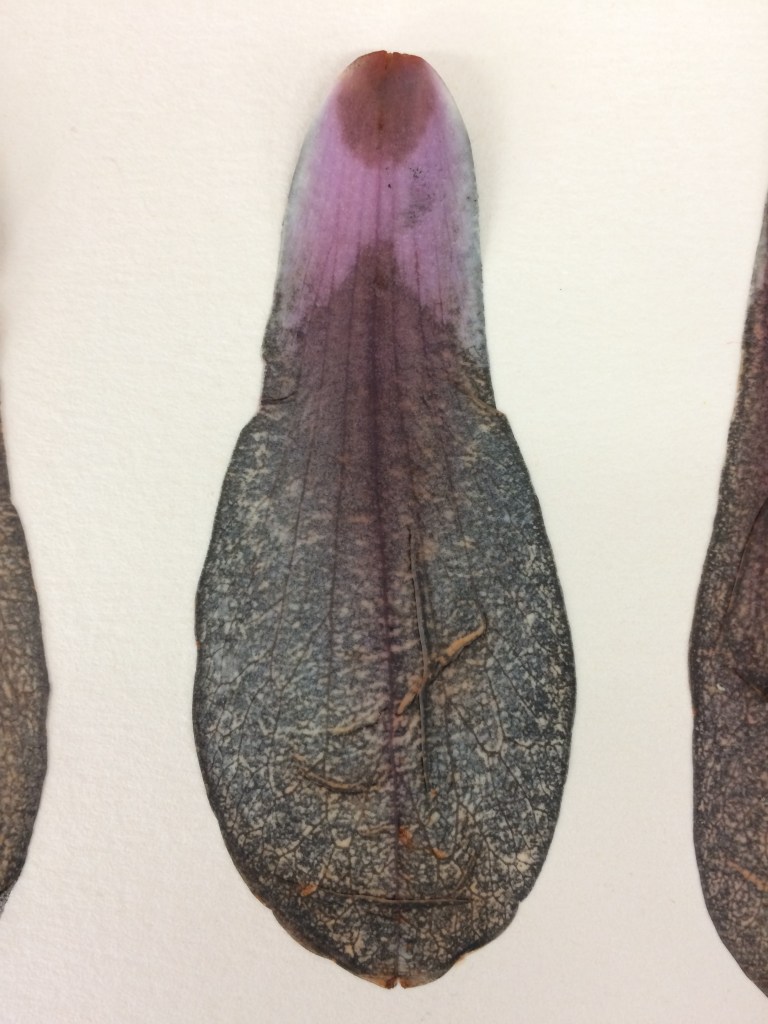
I thought the relief prints of petals looked too pretty on their own so I decided to use them as a small motif along the edges of some of my prints. They remind me of the veins in insect wings. Wings that have lost their insect.
C4RD
One criticism was that a book is not suitable to exhibit at a private view. I think that is ridiculous. I think private views are a time for looking at the art as well as networking. There is an issue though with people not wanting to touch the book because they think it is too precious. I am going to have to think of a way to enable people to interact with the book and not just let it sit on a table.
This time my mono prints were likened to a Jackson Pollock painting. Is it because there was a Pollock exhibition on earlier in the year and people have his art work in their heads? I don’t think Pollock was a print maker and I don’t remember his work being monochrome. I will have to study some of his paintings to find out.
Book of the Bees exhibited at C4RD. Film by Denise Pootes
The book of the Bees was an interesting project in bringing together different styles of printing. I thought the different sixes of paper worked well as I liked the interactive nature of unfolding and folding the pages. Overall though it was the viewer interaction that interested me most. How to get the viewer to do more than just visually interact with the art work? How to get the audience to touch the book?
